|
|
Background
 Unlike
other Mughal tombs, the garden of the Taj Mahal has been laid out
entirely in front of the tomb and does not play any part in the
'background'. Instead, the background has been provided by the sky. This
background is not constant; it changes its colour and texture more than
often, and the Taj is always presented in a variety of tints and moods.
Its shades are subtly reflected on the white marble surface of the Taj
Mahal which changes its colour and complexion accordingly.
 Marble
The Makrana marble used is of such a nature that it takes on incredibly subtle variations of tint and tone, according to the changes in the light, thus picturing the passing colour of the moment.
Forms and Lines
The composition of the forms and lines of the Taj Mahal is perfectly symmetrical. Here we meet with a beautiful admixture of lines, horizontal with vertical, and straight with curved - all harmoniously set together in the total unity. They adopt each other with amazing uniformity. The combination is entirely rhythmic and melodic. Especially the semi-octagonal alcoves at the chamfered angles which are perceptible from every perspective view and give a 3-dimensional appearance from the outset. They emphasise the diagonal lines and suggest depth.
Solids and Voids
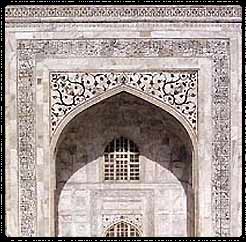
The great depth has also been further suggested by the double arches, one over the other, on each side of the central portal. The solids and voids have very judiciously been distributed to provide a variety, yet an undiminished uniformity. These alcoves, the balconies in each minaret, the chhatris near the dome, and certain pronounced projections in each facade allow a beautiful play of light and shadow.
Soaring Effect
The colossal height of the tomb, along with its pyramidal appearance (which is obtained by the receding plinths, the square tomb and the bulbous dome, along with the pilasters surmounted by pinnacles, the tapering minarets and the decreasing volume of the dome culminating in a kalasa) give it a soaring effect. It appears as if it is about to rise into the sky...an ethereal quality full of lightness and grace.
Correction of Illusionary Effects
 The
indigenous builders of the Taj Mahal fully understood the deceptive
nature of the human eye. They knew that the reality and its perception
and interpretation thereof differed. The plinth of the main tomb is
2'10'' high on an average. But the height varies at different places,
particularly the central point between two piers being in each case 0.5"
to 0.7" higher than the sides. This convexity has deliberately been
given to the plinth in the centre of each arch, or else the building
would have appeared as if it were falling down! The facades are not
exactly at a right angle with the plinth, but are slightly inclined. The
finial is a stupendous crowning feature which measures nearly 10
meters!! The architect fully anticipated the apparent size which a
finial would present from such a great height. It has therefore been
very ingeniously been planned. These features of construction
demonstrate the ability of the Indian architects to reconcile the
illusionary effects created by distance and light.
 Fluted Pilasters
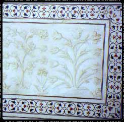
Sections in each facade have been demarcated by semi-octagonal pilasters that rise from the plinth of the main tomb. They have chevron patterns inlaid with black and yellow marble horizontally along their whole height. They appear to be fluted on each side though, as a matter of fact, there is no real fluting at all. They create a beautiful illusionary effect which the architect has very skilfully manipulated.
Uniform Size of Calligraphic Characters
The letter of the inscription around archways at the Taj Mahal, are generally supposed to become larger and larger above. On closer scrutiny, however, they are found to be of uniform size. Instead, the letters have been inscribed densely at the bottom, with little plain surface in between; the inscription becomes more and more sparse as it rises with more plain surface in between the letters. The diminution of the plain surfaces has been accurately calculated. Thus, the optical perspective of the letters has been reconciled, and unmistakable uniformity is obtained.


